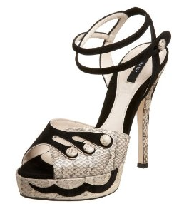
My new love: Bally 'Ilya' Heels

I couldn't resist showing off my recent purchase. (Read: Look what I bought today! On a trip that wasn't meant to be for shopping or remotely any purchasing!)

Photobucket

They were too pretty to resist and it was the last pair that so luckily happened to be in my size. So yes, I might be slightly materialistic or a label whore; call me whatever you want but I'm not the only one and they are just gorgeous. And I just really love shoes! Can't wait to wear them to god knows where.

I'm starting to think that I have a sort of Obsessive Compulsive Shopping Disorder because these are the second pair of heels I've gotten in 2 days. Not to mention 5 new books, some new jeans, shirts, leather jackets, sweaters, make up, whatever else there is to mention.

I need help!

Fashion Illustrator: Jean Phillipe Delhomme (aka: Unknown Hipster)

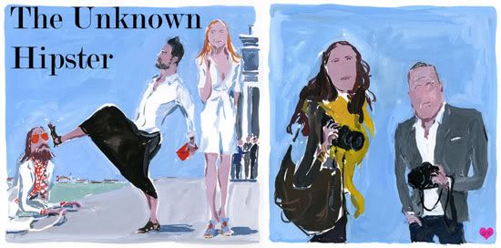
I've been meaning to blog about J.P.D for a while now but I suppose it has just slipped my mind. Amidst all the fashion photographers, street style and editorial alike; Delhomme uses his pens, coloured pencils and watercolours in order to illustrate what photographers capture.

His subjects are focused a lot on famous figures he encounters as well as prominent fashion figures of today's world. I really like how he likes to insert himself in many of his illustrations as if they were photographs. It doesn't hurt that his illustrative style is vibrant and captivating either. Personally, I really like his style! It's carefree and easy to look at.

Photobucket
Like on the illustration on the left, he illustrates himself with Marc Jacobs and Stella McCartney. Albeit the fact that he's being kicked in the head by Marc...
Then he illustrates two of the most prominent street style photographers, Garance Doré and Scott Schuman (aka: The Sartorialist). Rumour is that they're dating!

Photobucket

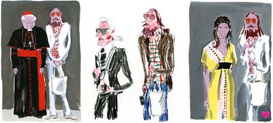
Famous figures such as the Pope, Karl Lagerfeld and Margherita Missoni are some of the people he illustrates. Love it. For more of his illustrations check out theunknownhipster or Jean-Phillipe Delhomme

Of colour and cut

There's a big trend that's been here all this year, cut-off and cropped pants. It surfaced sometime late last year and is here to stay as seen and updated from runways of Spring to Fall. Usually, pants reach at least to our ankles if not lower depending on the style and cut but a cropped pant stops at the ankle upwards. Some people might think that this look is extremely hard to pull off, that you have to be tall, slim and model-esque; but there are ways to make this hot trend work for you! Remember just to follow these tips...

Photobucket

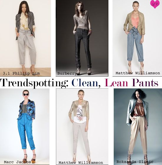
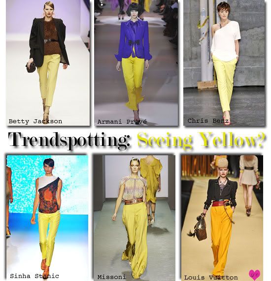
Taken from the 2010 Resort collections, all these pants have something in common - they are all cropped. There are various styles from something scrunched at the ankles to folded or just a clean, lean cut.
For those fortunate enough to have slim, tall, mile-long legs; you're in luck because you can basically wear any kind of pant and it'll surely look good. However, for those of us (like me) who are petite and of average frame; we have to look a little more carefully. Tapered pants (meaning they are smaller round the ankles) will elongate and slim your legs. Most of the pants here possess some tapering qualities. Slim, cigarette pants also look great as they elongate your leg too, by introducing one clean and straight line down the legs.
Remember to also keep in mind where the pant stops. Somewhere at your ankle bone or below mid-calf works wonders for petite figures. This is because if the pant is of an awkward length (like mid-calf or below the knee) it CUTS the leg and makes us look stumpy and bigger than we are. Ankles are an attractive feature as it's a slim part of the leg; accentuating that area will then visually draw attention to it.
From Roksanda Ilinic to Marc Jacobs, all designers have created a slick silhouette and whether they are a little baggier or slouchier still manages to be sharp and chic.

Photobucket

Secondly, I'd like to introduce colour! We all know that it might be hard to work with colour but it's simpler than one thinks. Big trends this season is eye-popping colour in bright hues and jewel tones. This time, I chose yellow as the different shades can complement almost all types of skin-tones. From muted yellows to bright, sunflower yellows; there are varying shades to suit everybody.
As depicted above, runway looks always add more drama in order to emphasise the effect designers choose to employ. But also, many of the yellow pants are also paired with more muted, neutral tones as to not overpower an ensemble. When translating the look to everyday wear; that's a key rule to follow. Don't overwhelm your outfit with too many colours and let the statement pants do the talking. If too many elements are added to an outfit, it'll look confused and sloppy. Or like some little child went crazy with finger paints. So pair yellows with neutrals like brown, black, beige, greys or any other muted colour for an everyday look.
However, if graphic is the way you want to go; remember to keep 'colour contrast' in mind. Opposing colour such as yellow and purple work surprisingly well together. Experiment with shades of blue as well.
But if you choose to have a light yellow as a pant, then don't be afraid to experiment with bright colours for the tops!

Photobucket
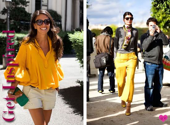
Credits: Garance Doré, The Sartorialist

For this lookbook, I got inspired by the cut and colour of Giovanna's (right) pants and her easy, effortless look. However, as a colour palette; inspiration arose from Garance Doré's street style pictures depicting the colour combination of yellow and beige. It's summer, fun and effortless. Plus it's a colour everyone's bound to have in their wardrobes.
I combined the tapered yellow pant with a beige billowy top to create a more summery look this time round.

Photobucket
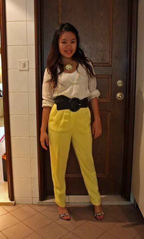
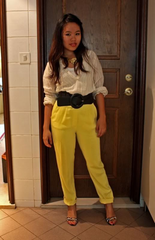
On Clarice: vintage yellow pants(mum's old pants), Esprit white tank top, Zara beige sheer shirt, Sisley belt, necklace from Far East Plaza, Guess wedge heels.

The high-waisted, tapered yellow pants help to elongate my legs while still ending at my ankle bone. The fact that it is slimmer at the ankles slims down the leg and the wideness of the upper part also hides any flaws. As the pants are somewhat more fitted, wearing a looser top helps to contrast that and balances the outfit. If everything is tight and tight, it doesn't necessarily make for a pretty sight and looks as if the life is being squeezed out of you. I brought it in the waist belt to break the colour tones and separate the sheer beige from the bright yellow. The billowy sleeves and sheer material of the top also lend it an effortless summery vibe.

Photobucket

Because my pants are tapered, you could also roll up the hems. This is made possible as the fabric can help 'cling' onto the rest of the pants without unfurling. Rolled up hems are very popular in many different runways and help to lend a chic summery vibe.
I translated these looks into something a person can wear everyday while out and about. For a day to night transformation, simply add a blazer on top or change into a more glamorous top. Keep in mind, with a silhouette like this, tops should be more voluminous to maintain balance.

Cropped and coloured pants 101:
- For petite figures, remember to look for a cropped pant which stops at your ankles or slightly above it. Anything mid-calf or below the knee is a NO NO! because it makes you look stumpy
- Tapered pants are slimmer round the ankles but for cropped pants, shouldn't cling to your calves if looking for a cropped, summery feel.
- High-waists also visually elongate your legs as low-rise cropped pants could result in making you even shorter due to the restricted materials that covers your frame. High waists also help to flatter the stomach making them appear slimmer.
- If choosing a bright colour for your pants, remember to go easy on the top. Experiment with opposing colours however, do work but remember not to overdo with too many cluttered accessories or other different colours. If unsure of what opposite colours are, reference a colour wheel. Stick to one statement look.
- For those with tanned skin, muted colours work well as they accentuate your tan. When opting for bright colours, be bright and bold but don't go deep; it will make you look sallow and even darker.
- For those with fair skin, rich but bright colours will pop on you. Muted colours also work well but remember to add contrast to that by pairing it with a bright top or some accessories. If everything is too muted, you'll look dull and very very fair. Steer clear of shades that are somewhere down the middle (neither muted or bright).

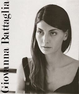
Fashion Icon: Giovanna Battaglia

Photobucket

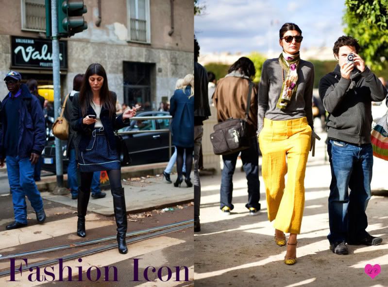
Many people oblivious to the fashion industry must wonder; who exactly is Giovanna Battaglia? Perhaps you've seen her face around here and there, but what exactly does she do? Giovanna is one of the 'Vogue Soldiers' working as a fashion editor for Vogue L'Uomo (Men's Vogue). Her signature sartorial style (look at the wonderful use of alliteration!) has landed her a permanent fixture in many street style blogs including that of The Sartorialist and Garance Doré. Being a former (and exclusively) Dolce&Gabbana model as well as a stylist, she has a wardrobe many editors would envy. However, there's more to her than merely meets the eye.

Photobucket

Here are some of my favorite looks that she has showcased over the years. Her easy-going and chic style is reflected in the way she wears her clothes, transforming looks from day to night by merely changing a jacket or some accessories. Although keeping to neutrals, she always manages to inject some colour into her wardrobe such as that displayed by those bright yellow pants.

Photobucket

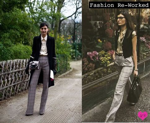
Something that makes Giovanna different from other editors and fashion insiders alike is her ability to re-work her clothes. One wouldn't catch Anna Wintour or Carine Roitfeld in the same outfit twice, but for Giovanna; she definitely has her wardrobe favorites and staples. As pictured above, Giovanna is able to transform the same pair of pants into two completely different outfits with different vibes. She is often pictured with her knee-high black boots or birkin bag and grey turtlenecks amongst others. And she's definitely not afraid to show what she loves by re-wearing and re-working her pieces.

Photobucket

Giovanna favours labels often thought to be slightly unsexy, more tailored than anything such as Marni, Prada or Viktor and Rolf. However, she has a penchant to be able to wear them in such a manner which is far from frumpy. Always effortlessly elegant and classy she keeps people guessing as to how she's going to wear her pieces next.
She always keeps it simple and fresh, layering different key pieces together to create a seamless outfit. It also doesn't hurt that she can show off those legs in a pair of killer heels and short skirts. Her minimalist style with makeup kept to a minimum and subtle accessories are always tasteful and she always knows what works on her.

If only we could all have the same wardrobe and ability to mix and match and transform a look by putting on new shoes, jacket and some accessories. Then again, Giovanna is Giovanna just because of that.

Credits to: The Sartorialist

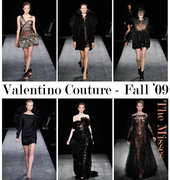
Couture Fall 2009: Valentino

Valentino has become a name synonymous with the signature 'Valentino Red', flowing gowns, feminine silhouettes and Oscar Red Carpet worthy looks. When Valentino Garavani, the label's original designer stepped down from the pedestal in January 2008; it has since had to regain its footing to maintain the splendour that Valentino left with his name.

Taking the helms this time round are Valentino's former accessory designers, Maria Grazia Chiuri and Pier Paolo Piccioli after Alessandra Fachinetti's unsuccessful run as Valentino's successor. Drawing from Valentino's plentiful archives, Chiuri and Piccioli managed to depict something that remotely resembled something Valentino would design: feminine, detailed, pretty and lacy. Although it might seem like they are rooted in the past following Valentino's shadow; they have also managed to break away from slight conventions by injecting a certain youthfulness in the collection.
I'm really a sucker for anything pretty and wonderfully, frivolously lacy; hence there's always been a natural affinity to Valentino's designs. I remember the time where I used to see my darling old grandmother break into her gorgeous red Valentino gown and how that would make me gush at the impeccable workmanship.

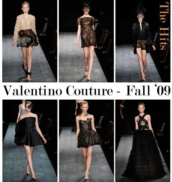
This season is however, not without its faults. The main focus from the two designers being a demure yet youthful combination of black, ruffly lace over nude. Lucid Couture determines some of the best and worst of Valentino's Fall Couture collection.
Photobucket

Left to right by row:
1. An intricately nude ruffled blouse is paired with a springy black lace skirt over the same nude material trimmed with more ruffles! I like how it shows the right amount of skin and how ruffles can remain chic without looking like a court jester.

2. Black lace dress over nude. What's different about this dress is its silhouette as it reminds me a little bit of an oversized t-shirt (borrowed from the boyfriend of course). Love their use of lace masks for a little trompe l'oeil effect too.

3. One of the only shorts to be showcased in this collection. Black lacy shorts paired with a black ruffled blouse and a black jacket embossed with silver flowers. It's all subtle in its own way (specially the flowers on the jacket) but combined together just makes for a darling combination.

4. The little black ruffly dress. Love the simplicity of the black dress with the minor (or not so minor) detailing of that ruffled flap on the side. Some hate it, but I think it's what makes it stand out. Imagine going to a cocktail party with this number on!

5. More of an embroidered lace cutout dress, I really like the fact that it looks like you've stuck on little lace pieces to the base of your neck when really; it's connected by a nude mesh material.

6. Of course, no Valentino collection would be complete without its fair share of gowns. One of the only gowns I thought was decent despite its atrocious wedding cake layered ruffles. I just like the asymmetry of the bodice.


Photobucket

Left to right by row:
1. The little dress has way too much going on. Prints here and there! Combine that with lace! Maybe some tulle and ruffles! Looks like Valentino puked on it and voilà, this contraption was created. Not really a pretty sight.

2. How are we supposed to take a good look at a dress when one can only fixate on the coat? It looks like a hybrid of a turkey tail and a squid. What would Anna Wintour say?

3. Sometimes ideas are best left to the head. The combination of the skirt and the nude blouse could POTENTIALLY be something marvelous. However, in this case it just didn't work. The front of the skirt with ruffles-a-plenty reminds me of those coral in the sea. Then there's that weird, prettified Darth Vader neck cape thing going on...

4. Little black dresses are musts. But not when it looks like you've stuck a turkey on to your back. Why the unnecessary ruffles?

5. And we are back to gowns. This one looks like a dismally overwrapped Christmas present. With bows and ruffles aplenty. Or one of those crackers you pull to get those little treats inside?

6. I don't know what to say to the last gown. Shapeless with weirdly shaped 'ruffles' to boot. Looks like an overactive transmission of radiowaves or something. I know, what must I be thinking? Years of chemistry has seeped into my mind but I just don't like what I see.

Another bizarre thing which permeated throughout the collection was the weird ruffly shoes. There comes a point when ruffles just become a little overdone and with lace, ruffles, organza and tulle aplenty I think it's due time Piccioli and Chiuri done a little once over with an editing eye. They should've stuck to the nude shoes present in most of 'The Hits' pictures.
Nevertheless, I think Valentino has gained some steady ground and we do owe it to these two designers but it'll be another couple of seasons before they finally find their niche and deliver a solid collection.

But, where did the Valentino red go to?

Style on legs: Emmanuelle Alt

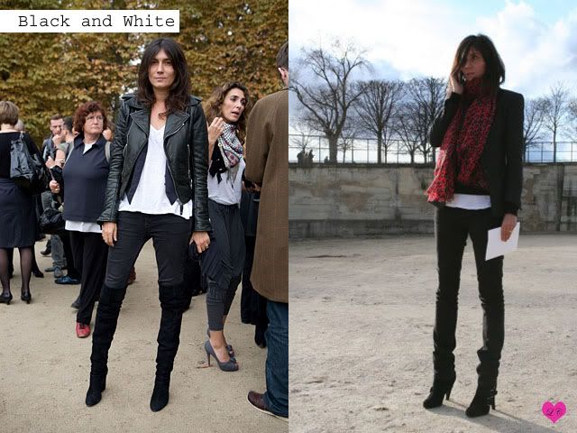
There's something about Emmanuelle Alt, fashion director of Vogue Paris that's undeniably stylish. There's no doubt that the whole lot at Vogue Paris are just painfully stylish (Carine Roitfeld, Melanie Hyunh, Geraldine Saglio) but to me, Emmanuelle takes the cake. She stays true to her aesthetics by defying the norm.
Photobucket

She sticks to monochromatic colours, most often favouring an all-black ensemble. Sharp, androgynous and subtly sexy. Some might say "safe and boring" however due to her impeccable eye for fit and proportion; nothing about Emmanuelle is ordinary and plain. She knows what fits and looks good, thus combining these two elements together equates to a word frivolously thrown around as "fierce".

Photobucket

Favouring cargo pants, well tailored jackets (her biker jacket is most definitely a recurring theme), must-have basics, skinny jeans and gravity defying architectural heels; she is confident, seemingly sulky (specially in pictures, perhaps she doesn't like to have them taken?), fabulously cool and elusive - the lucidity with which we understand her image is undeniable.

Maybe we all need to take a little cue from her, all that s**t we throw on before leaving the house looking like an over-decorated christmas tree does not necessarily equate to fabulosity! She is not really one to follow trends, sticking to her own palette she never fails to be stylish. Simple, tailored, slightly androgynous, indifferent and oh-so-cool.

Fashions fade, style is eternal - Yves Saint Laurent

Take it from the boys

The other day, there was a tribute for Michael Jackson at Zirca. Dubbed the "Black and White Party" it was sort of obvious what the prevailing theme for the night would be: come dressed in full black or full white (and you get two free drinks). It was ladies night nonetheless...

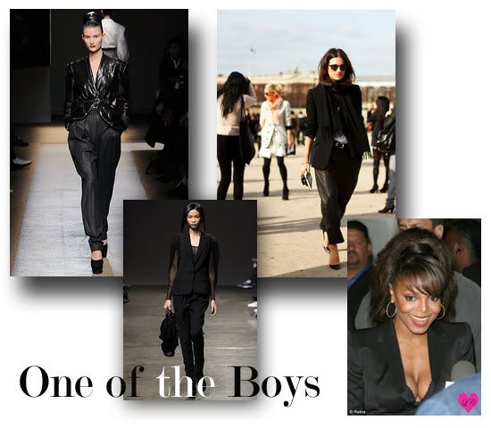
Taking up this occasion, I decided to go for a full black ensemble mostly inspired by Michael's sister, Janet and her penchant for wearing 'suits' to red carpet events. It didn't hurt that a lot of Fall 2009 runway trends also teetered on androgyny; embracing the masculinity of a suit dedicated for women. Thanks to YSL who made Le Smoking suit so fashionable, sparking the trend for the liberation of women no less.

Photobucket

All taking inspiration from men's tuxedo, it has been altered to fit a woman's body. I opted to find suits which show off a little here and there which deviates slightly from the traditional black and whites by sticking to one colour.

Left to right
1. Yves Saint Laurent is famed for their suits, after all they are the original creators of Le Smoking. Tapered pants is a fashion trend here to stay after seeing it on the runway for at least two seasons. The use of the leather juxtaposed to these tailored pants create a slick yet feminine approach to the usual pantsuit.
2. Doo.Ri combines the jacket with sheer arms to create a feminine, ethereal yet still defined silhouette. I need to get me one of those!
3. A little something the Sartorialist captured during Paris' fashion week. It's easy and cool and has such understated elegance and nonchalance. Love the leather cut-offs (all the rage this season too)
4. A little Janet Jackson that I tried to emulate (minus the big hair)

PhotobucketPhotobucket
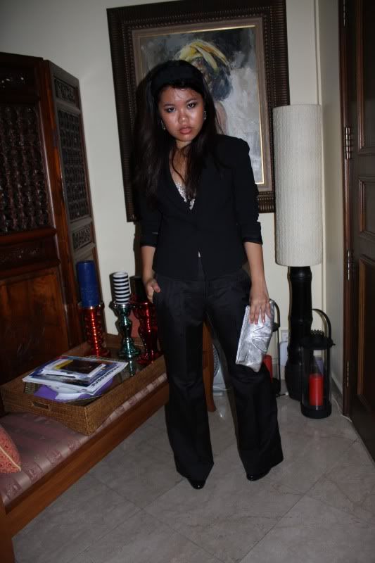
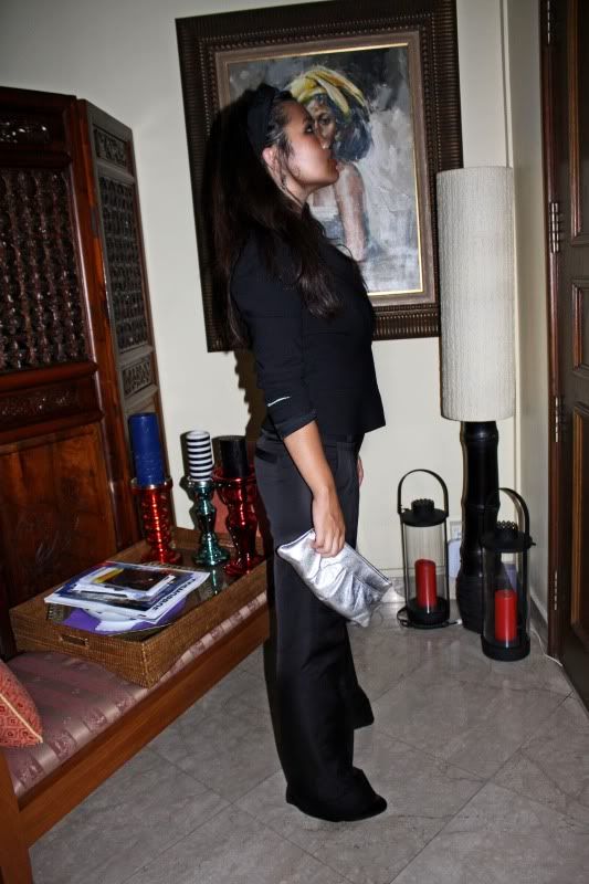
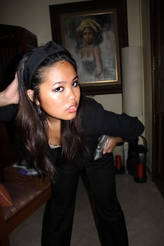
On Clarice: MaxMara black blazer, Banana Republic black wide leg pants, Miu Miu heels, Lauren Merkin clutch, Marciano embellished brassiere, Mango headband

Photobucket

Photobucket
So yes, I was being a little 'skimpy' with the no-shirt-under-blazer but I was well covered up thank you very much.

The wide pant always gives you a slimmer and taller appearance while one cannot go wrong with a basic colour like black. As mentioned before, this is a fitted blazer cut on the hips with a cinched waist which defines, shapes and works great with more petite figures.
I find with a more androgynous outfit like this - minimal accessories work better because over-doing it rids of the whole image you're trying to portray. So if you are a person who tends to pile on the accessories - remember to take the last item you put on, OFF!

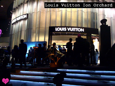
Launch Party: Louis Vuitton Ion Orchard

As we all know, Ion Orchard's official launch date is 21 July 2009 (keep it on the calendars!), however ever-evolving Louis Vuitton decided that things needed to be done just a little earlier.

Most of you have probably walked by Ion Orchard and have seen people slaving to get Louis Vuitton finished. Day and night the work never stops and today; the official launch party has begun. Celebs, media, fashionistas and tai tais alike have flocked to the much awaited launch of the iconic store known for its leather luxury goods.

Outside the event, Moët et Chandon (also owned by the LVMH company) were abundant as guests happily sipped on their champagne glasses before being ushered in to the lush space and getting a sneak peek at all the treats Louis Vuitton has to offer specially stamped with "Louis Vuitton Orchard Road Singapore". The exclusivity of these goods remain at about 10 per item - specially at the launch party so they're going to be snapped up readily!


The circular and sleek interiors of the Louis Vuitton in Orchard Road dominate with many exclusive goods being sold. Personally - I find it bizarre when people flock to spend lots and lots of moolah on such goods till they have to QUEUE to just get into the store.
Even in Paris you walk in as you please. They don't impose dress codes (meaning you can walk in with slippers if it so please you) and staff don't look at you condescendingly. It's a much nicer shopping experience but well, who knows? Ion Orchard might be the milestone for something new.

It seems like although LV is a luxury brand, it has somehow tarnished its reputation as one increasingly becoming a commodity. But hey who am I one to talk? I suppose it's not like I'm not guilty of purchasing items there either - but that's just my two cents worth.