Many designers have finalised their ad campaigns for the Fall 2011 season and my, what a lavish spread it is! I thought I would show several of the ones that caught my eye, whether good or bad. I feel like ad campaigns should exude an attitude and most importantly, a concept. It's not only about selling beautiful clothes but a certain lifestyle that comes with it and that we consumers, would want to buy in the hopes of tangibly encapsulating the attitude of the campaign.
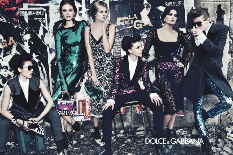
Dolce & Gabbana
I always love the plurality of the Dolce & Gabbana campaigns. It's never one, two or even three people but always a group. The composition exudes their signature Italian "refined" glamour. Love the juxtaposition of the androgyny and femme fatales. Makes me want to wear their dresses with those gorgeous blazers. Can you spot all the famous model faces in the campaign?
Givenchy
They have got to be one of my favourite fashion houses over the past several years. I like the slightly masculine (but not too man-repeller) attitude of their clothes. It's edgy, chic but embraces lots of femininity all at the same time. This ad campaign also features Naomi Campbell but I prefer Mariacarla Boscono all the way! Look at that lushness but it's really quite a simple campaign.
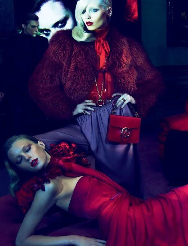
Gucci
I think their Fall 2011 really captures a certain attitude that many other campaigns may not have. The heavy fur, jewel-toned colours and overall hue of the campaign makes for a visual feast. Simple but interesting, contrasts between light and darkness - I love it!
Props to Frida Giannini for really turning Gucci into something not so logo oriented that made the brand really tacky for a while. Abbey Lee-Kershaw looks sublime in these photos.
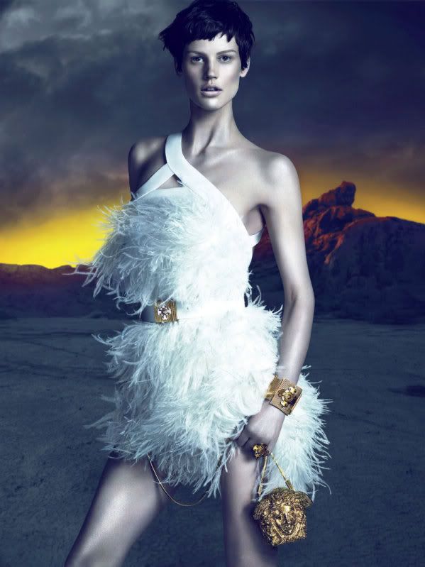
Versace
I WOULD DIE (
live and die again) IN THIS DRESS! It's so beautiful! Opulence with such a clean, androgynous aesthetic that's contradictory to the dress itself. Versace has steered itself to a direction that is so much more pleasing to my eye in the last couple of years. I remember a time when it was all about skimpiness... and now Donatella finally understands the impact of glamorous understated clothes that hint at the female figure rather than "Hello, I'm $50 an hour."
Now, can someone please adopt me and buy me this dress? kthx.
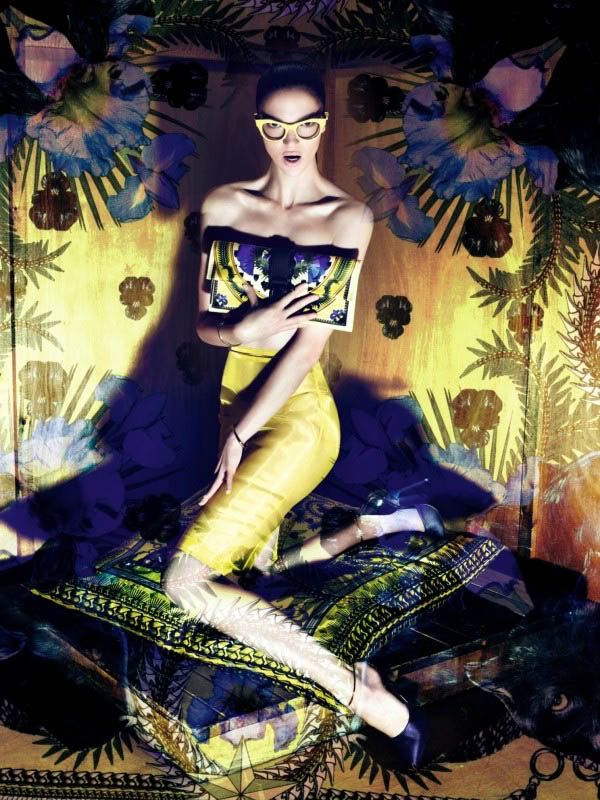
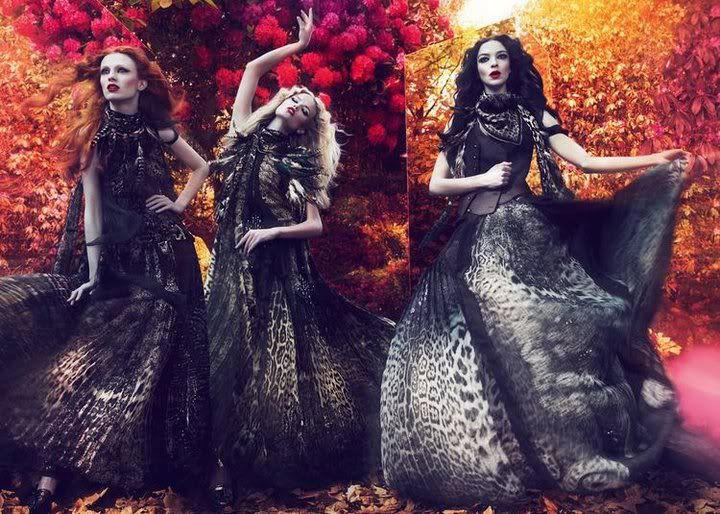
Roberto Cavalli
OK, I admit I was surprised at the amount of designers' ad campaigns I liked that I usually didn't like. Case and point: Roberto Cavalli. For those living in Singapore, you know how uglayyy as a hawker centre bin the ad campaigns they have plastered on the walls and windows in Mandarin Gallery are.
This dear friends, is captivating! I think I'm a sucker for contrasts: the dark and neutral coloured leopard prints really stand out against a luscious background of red, pink and golden leaves.
If only we all looked that good frolicking in Fall foliage... in full length silk dresses no less.
I've more campaigns to show you but it's a lot of pictures, so read on!
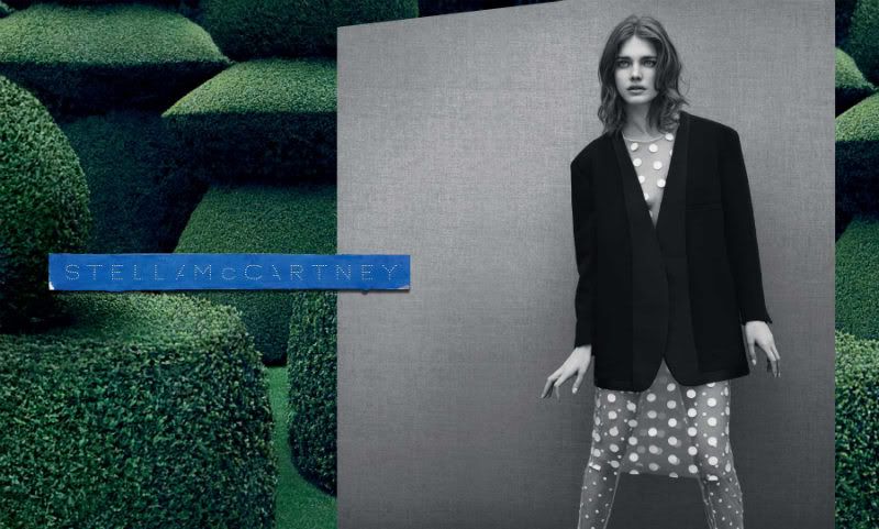
Stella McCartney
Natalia Vodianova can do no wrong but, Stella McCartney is known for her simple, minimalist look so I love that this campaign really captured her vision. The contrast between a lush, green manicured garden to the black and white portrait is great. The symmetry and clean lines are very Stella. So effective and effortless.
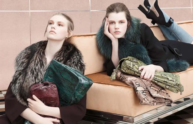
Prada
Actually not a big fan of some of Prada's clothes - definitely meant to stay on the runways and red carpets. I despised that colour blocked, pleated shift dress this season but LOVED their monkeys and stripes of last season. One pictures (above) caught my attention though. It's simple and their clothes are not ugly. I would gladly go hungry from their accessories like those divine clutches and genius trompe-l'oeil boots feature above. Also, those fur coats really would not hurt in Bostonian winters...
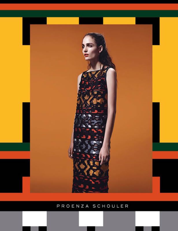
Proenza Schouler
Everyone knows Proenza Schouler's PS1 bags and how they're so cool and edgy and roomy and whatever else people get them for. Not saying they're not great bags, I'm sure they are and I would love to add one to my collection but look at this campaign! Their clothes speak volumes, so chic and interesting. One thing that makes this so outstanding from an artistic perspective is that the portrait is in the middle, unmarred by a busy background. Then on the edges they continued their version of a sort of ikat tribal pattern that is found throughout their collection. I love the continuity and thought of this campaign aesthetically.
Fendi
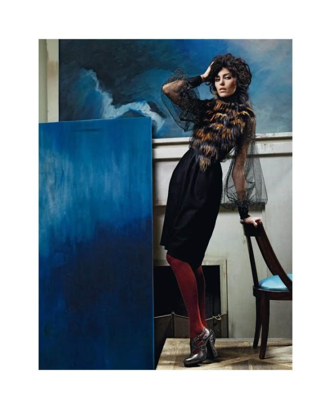
Initially, I wasn't a big fan of Fendi's ad campaign, found Anja Rubik's black curly hair a little too Chinese aunty to me. This picture is wonderful though. The blues that is found consistently in the background to the fact that Anja has no blue on her whatsoever. I wrote that I wanted those shoes in my "
Shoe-o-graphy" post and they are even more gorgeous on! And please lah, that fur and tulle shirt/jacket thing is ravishing.
Nina Ricci
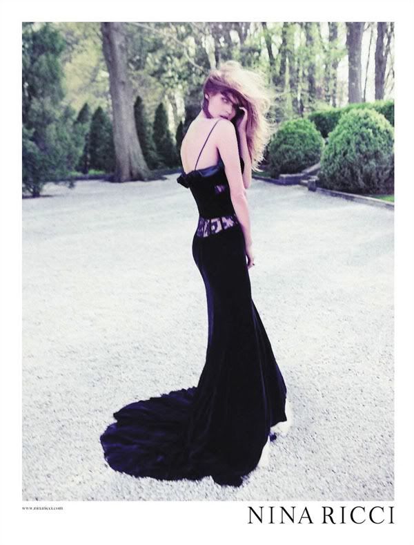
Less is more: pure elegance. Nina Ricci's dresses (for the exception of the spider-webbed atrocity worn by Christina Ricci) are so Parisian chic. Love her shoes too!
Blumarine
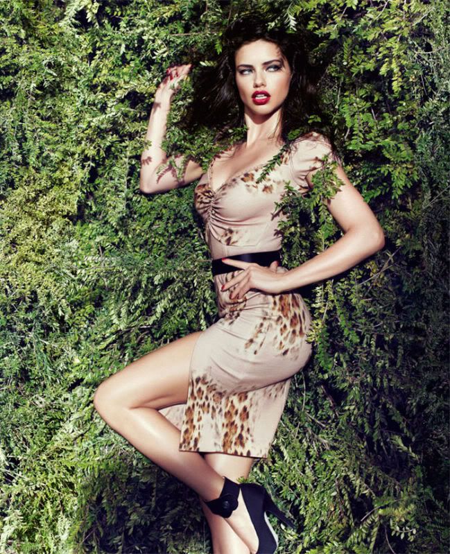
I haven't liked Blumarine's designs for quite some time now. They come up with stellar pieces here and there but sometimes it's just not that consistent or unique. Adriana Lima does the label justice with her Victoria's Secret Angel curves here. For a person who's lying in a bed of leaves for the entire campaign, no one can make it look sexier. Hello, teacher? No sorry, it's just Adriana Lima and her red lips.
DKNY
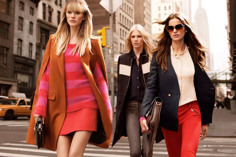
Rounding off the post with an ad campaign that I think, most of us can afford. The thing that irks me about DKNY is that their campaigns all look so NYC edgy-chic but their clothes in-store are a bit of a disappointment. I know all of us were not born supermodels who can make sacks look like fashion but, you'd think some of that Manhattanite attitude would translate.
Anyway, they look like they've got a fantastic collection ready for Fall and I am in complete love with everything these models are wearing. Capes (
check), juicy colours, clean lines, great blazers, tailored aesthetic. Oooh let's go to DKNY right now!!
Credits: fgr & respective designers
Hope I didn't bore all of you. For those of you who made it down this far - please give yourself a big pat on the back. Just wanted to share some inspiration, maybe this will help you think about what you want to get yourself for the upcoming Fall/Winter seasons.
For me, I just loved the creativity and artistic direction that these campaigns possessed. And of course, makes me jealous for those of you who can hoard something from each of these collections...
Have a great week ahead!

1 comment:
awesome campaigns !!
www.glisters and blisters.com
Post a Comment